
PERSONAL
IRCTC Rail Connect
Redesigning India's most-used train booking app
A personal redesign concept that reimagines IRCTC Rail Connect with a cleaner UI, faster booking flow, and a design system that finally feels native to mobile.

ProductIRCTC Rail Connect Redesign
My roleProduct Designer
Timeline2025
SkillsMobile UX, UI Design, Design Systems
TeamSolo — Personal Project
Problem: 800,000 daily bookings. Still feels like 2012.
IRCTC is critical infrastructure for India — but the app feels like a website squeezed into a phone. Cluttered layouts, unclear hierarchy, and too many steps to book a simple ticket made it the perfect redesign challenge.
Key findings
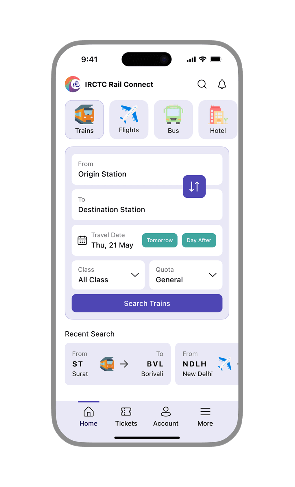
Search is buried under promotions and banners
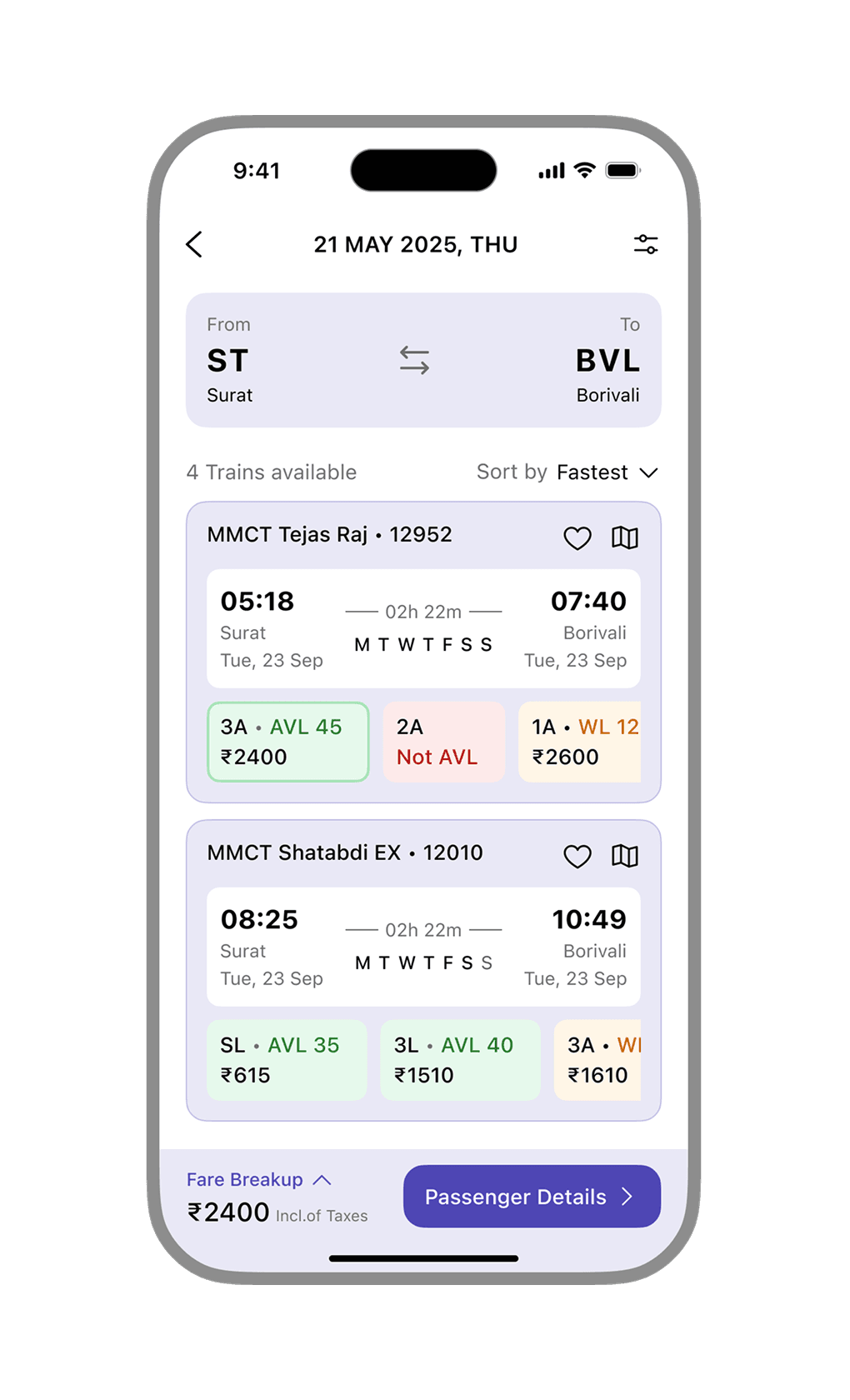
Train cards pack too much — fares and availability are hard to compare quickly
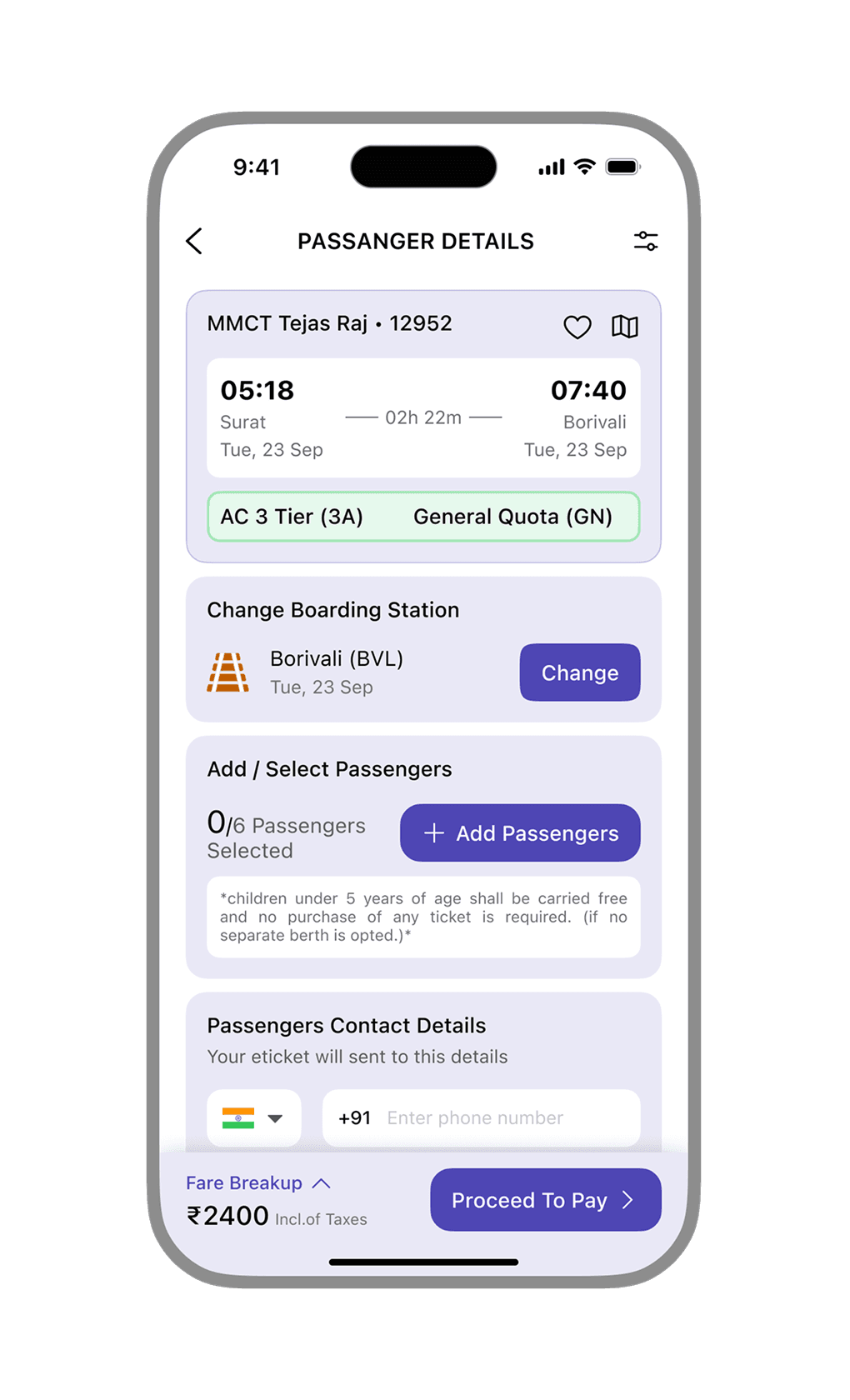
The booking flow breaks at passenger details — too many redundant steps
Inconsistent UI makes the app feel untrustworthy at the payment stage
Solution: Three screens. One clear job each.
Home searches faster. Listings compare easier. Passenger details flow without friction. Every decision was about reducing steps, not features.
 Task-first home screen with recent searches
 Scannable train cards with color-coded availability
 Clean typography hierarchy across all screens
 Consistent iOS-inspired design system
 Streamlined passenger details and checkout
Impact
The information was always there. It just needed structure. A redesign that proves IRCTC doesn't need new features — it needs a UI that respects the user's time.
